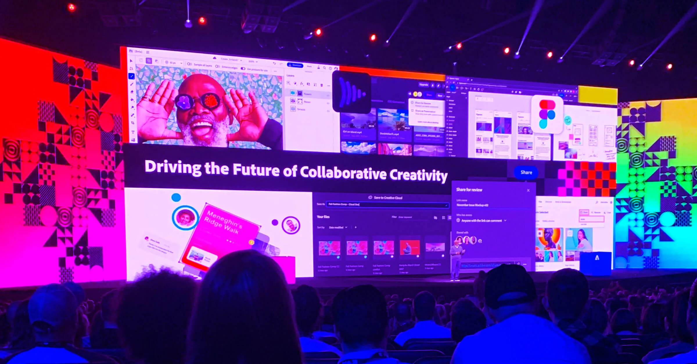
My manager asked me in a 1:1 during the summer, “Have you picked out a conference you want to attend yet?”
I told him I was torn between two and made a promise to pick the first one that released their schedule.
This year, I chose to head to Los Angles for three days of Adobe MAX. One of the great benefits about being a Sifter is professional development, especially when that comes in the form of conferences. As most of us have been navigating the conference scene virtually for the last two and a half years, I was pumped to be able to attend in person. Being a creative, it’s impactful to get out of my work-from-home routine and explore a new city. Surrounded by 6,000 fellow creatives, ranging from designers to photographers, design leaders, and even some more technical folks in the background, it was fulfilling to be learning new skills and ideas I could start applying immediately.
Innovation to the MAX
Adobe MAX is one of Adobe’s annual conferences, boasting 100+ sessions (both in-person and virtual), including keynotes, giveaways, hands-on labs for skill building, and a sneak peek of the upcoming projects being worked on in the Adobe Labs.
Inspirational keynotes started on the first day at the Microsoft Center, followed by breakout sessions throughout the Los Angles Convention Center and the JW Marriott. Floating from room to room, you could feel the energy as people talked with friends, colleagues, and fellow attendees.
The theme this year was “Creativity for All,” with Adobe heavily leaning into their commitment giving back to the design community with ease of access for non-profits and education. Many of the teased features and products rely on Adobe Sensei, their AI capabilities, from Intertwine in Illustrator to advancements in Express for non-designers to create branded content for social and beyond.

MAXimizing learning
Leaving the keynote feeling energized, the rest of the days were filled with back-to-back sessions I picked with purpose and meaning. Packing two to three, one-hour long talks each day brought me renewed sense of craft and self-reflection.
I learned some nuances about speed and value graphs in After Effects from Nol Honing, who taught about understanding the perfect time and place to have effortlessly smooth transitions.
MAX veteran Michael Flarup, a Danish designer passionate about app icon design, talked about having a design record showing the evolution of your product from humble beginnings to present. He reminded me of my own adoration for systems and having a unique history of the Sift brand. I realized how much I’ve tweaked and molded our visual presence to get to where we are now.

French designer and letterer Martina Flur whisked us through her “golden secrets to lettering”, speaking with a fresh perspective for these kind of talks. Rather than giving her background of feeling uninspired with her career, leaving to pursue lettering, and pushing her works/achievements, she gave a mini course on breaking down the letterform into the “mother shapes” (rectangle, circle, and triangle) and building from there.
This made me reminisce about my own ways of wanting designs and projects to be perfect from the start, but Martina’s lesson made me realize that sometimes, you need to break things down to their simplest forms in order to get great work.

